Sometimes I feel like I am in a South Park episode. The one where Butters is Professor Chaos and he’s trying to take over the world and every time he comes up with a plan his sidekick General Disarray tells him, ‘The Simpsons did it!’ It’s like that in Romancelandia a lot of the time. You come up with an idea and go looking for pictures or quotes and then find that someone had beaten you to the punch.
Example. I was going to do this post on Nathan Kamp and how he seems to be on every frickin romance novel cover and why the hell is this the case cause yeah, he’s good-looking but he’s not that good-looking. Went to get some pictures and saw that Jessica over at Racy Romance Reviews had all ready done it. And her post was so much more eloquent and rational than I would have managed I thought to myself, ‘Yep, I’m not gonna even try!’
The I was going to do this post on UK vs. US covers and saw that Meljean had done something similar over at Oddshots. But you know what. I have come to the same conclusion poor Professor Chaos did. Romancelandia has been around for aeons and will be around after I go and we always talk about the same subjects again and again and again so another repetitive blog post ain’t gonna kill us. Plus, I have pretty pictures I want to show you all…
So UK vs. US book covers.
There are different reasons for a change in cover which Meljean goes into in her blog post here. But I have to say, maybe it’s because I am from the UK, I think the UK edges out the US a lot of the time…*controversial* Let me show you.
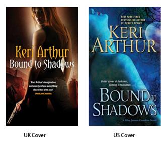
Keri Arthur
I just prefer the UK one. It feels more evocative somehow. Although I do like the colour scheme of the US one, it feels like anyone with Photoshop could have done it (Although I know that isn’t the case..)
Nalini Singh
I prefer black over lurid pink. I’m not sure what possessed that particular choice. Admit it, you’d be much happier reading the UK cover on the train.

J.D. Robb
Again much more evocative. I find the US covers really garish and it doesn’t tell me anything about the book at all.

Sherrilyn Kenyon
Admit it, it’s just much prettier. Although admittedly, the US covers have had a make over and I do prefer the covers with just the sigils on them to the lurid men covers they used to have.

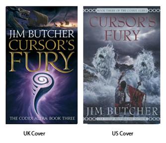
Jim Butcher
I think the US covers for his Codex Alera series are like a badly drawn school project. I really dislike them. (Although they are probably drawn by someone really famous.) I was so happy when Orbit brought the new UK covers out. I think they convey the fantasy feel without falling into the usual pitfalls of fantasy covers.
As for his Dresden Files series. I also prefer the, admittedly, boring UK covers. Why? Because as much as I like Chris McGrath’s covers he draws Harry with a freakin’ fedora on and HARRY NEVER WEARS ONE IN THE BOOKS. EVER! It really irritates me. So I prefer the UK ones cause they leave me to imagine the characters myself without putting ideas in my head. Of erroneous hats.

Ann Aguirre
I love the new cover for Ann Aguirre’s Corine Solomon series. It’s dark and moody much like the book (although there are lighter moments). I do like the US cover as well, I just like the UK more. Sometimes that happens. Even though the US cover is probably more representative of the character.

Eloisa James
No contest as far as I am concerned. It’s a beautiful picture and I love the little chess piece in the picture. It gives you a clue to the content but looks out-of-place there so you give it a second look. It’s just such a lavish picture. Very representative of Elosia’s work I think.

Julia Quinn
Although the UK covers are a lit too chick-lit in execution, I do think that they translate the sense of fun and humour that is apparent in Julia’s work. Unlike the US covers that are so vague they almost seem surreal.

However there are exceptions with Julia Quinn. The two ‘Cavendish’ books for instance. I much preferred the US covers. Go figure.

Lisa Kleypas
It’s not always the case that I prefer the UK over US either. I prefer the US covers to Lisa Kleypas’ newest historical series. The blue dress is stunning and much more interesting to my eye than the far away figure in the UK cover. US cover win.

Rachel Gibson
I do like the UK covers better. Again, they seem to convey a sense of fun. Although, that said, it is obvious that the UK publisher is trying to make this cover seem anything but romance as that is a dirty word in the UK.

It’s a subject matter that has been discussed ad nauseam and it’s true that while you know what you’re getting when you have mantitty or a back/dress combo, namely a romance novel, why does it feel that romance readers get the short end of the stick when it comes to cover art? Especially in America. Why is it that YA novels get beautiful covers like this?

And romance readers barely warrant any effort at all. Srsly, I CAN do better than this on Photoshop.
Why is there more effort put into a book for teens, than into a book for adults? Because that’s what it feels like. ‘Oh, they’ll buy it regardless so let’s not bother.’ But that’s a whole other subject for a whole other day.
(I’m probably going to get panned now from rabid Chris McGrath fans..*ducks*)


 Kitty and the Midnight Hour.
 Kitty Goes to Washington.
 Kitty Goes On Holiday.
 Kitty And The Silver Bullet.
 Kitty And The Dead Man’s Hand
 Seb’s Surrender – Carol Lynne

